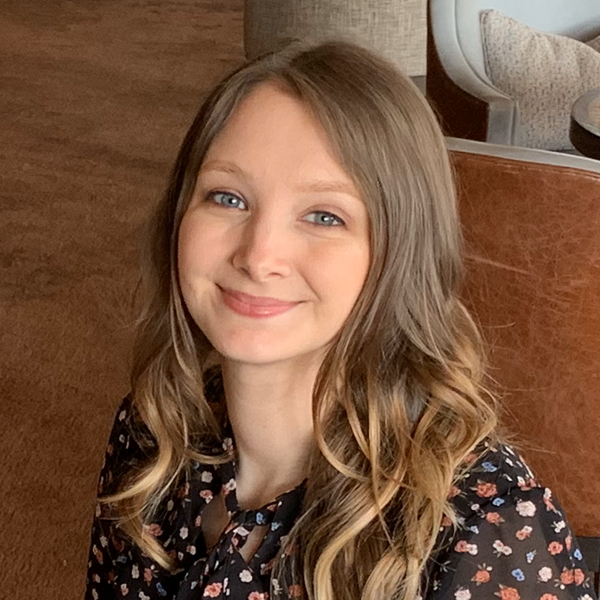
Tell us a little bit about your background and experience before you joined Cadmore.
I’ve been designing since 2009, originally focussing on design for print and gradually moving towards digital design. My love of all things design started much earlier when my parents brought home our first family computer. During the dark ages of dial-up internet, you could find me experimenting with logos in Microsoft Paint or building inaccessible flashy fansites for my latest crush. I was lucky to find something I loved doing from a young age.
I cut my teeth as a graphic designer within local government: it was truly a warm and encouraging environment for a fledgling designer. Over the years I’ve gained experience within many industries including advertising, travel, and hospitality. A personal highlight was receiving in-depth accessibility training. It was a lightbulb moment that made me become a much more empathic designer: ensuring the user always comes first and is the center of every project.
What are some of the most interesting projects you’re working on?
I’m lucky to work on a wide variety of projects at Cadmore. It’s the diversity of work that I find most interesting – no two days are the same. There’s a real risk of creative fatigue when you’re working within the same format day after day.
I thoroughly enjoy product development projects. It’s great to work with the team to enhance the platform and make it the best experience for our users. In between these projects, I’ll help produce marketing materials that showcase our awesome platform and promote our company.
An exciting and very current project has been our rebranding exercise. It’s been an incredible opportunity to take ownership of our visual identity and I’m excited to share it with everyone. Stay tuned to a screen near you!
What is a common design mistake you see made by non-designers?
I guess what is right or wrong design-wise is a matter of perspective and preference. Thanks to an abundance of available user-testing data, there are common guidelines on how to produce designs that are both legible and comprehensible.
A common mistake I see that would go against such guidelines is color contrast. Text and graphical objects such as icons need to stand out from their background. That sounds simple enough, however, up to 5% of the population have color vision deficiency. Some colors such as bright blues and oranges can be surprisingly inaccessible. It’s easy to be caught out. There are awesome open-source tools out there to analyze designs and keep you on the right track. I aim to be as inclusive a designer as possible and that anyone, no matter their abilities, can easily understand anything I’ve worked on.
How do you know when the design is done?
Who knows?! When your time on it runs out, maybe? Joking aside, with all of the information you wish to portray, alongside meaningful decorative elements, there comes a moment when you’ve struck a visual balance. It’s like yin and yang: text and embellishments come together to produce something that’s not only legible but also looks great.
What are your interests outside graphic design?
Living where I do in Scotland I’m under an hour’s drive from some amazing places. Edinburgh is beautiful and historic, Glasgow has incredible entertainment and restaurants. I’m never far from an idyllic nature reserve or somewhere with a fascinating history to explore. Besides that, I love to relax with family, watch a film, and eat good food!.

